Roar92_
Reserve Player
- Joined
- Feb 12, 2025
- Replies
- 81
Whatever colour it is, it’s not my fave. Got your Pantone book handy so you can tell me what colour it is?Definitely not Green FFS.

By registering with us, you'll be able to discuss, share and private message with other members of our community.
Sign Up Now!Whatever colour it is, it’s not my fave. Got your Pantone book handy so you can tell me what colour it is?Definitely not Green FFS.
Whatever colour it is, it’s not my fave. Got your Pantone book handy so you can tell me what colour it is?
In the article on the BR website, it states the shorts on the third kit are olive.Definitely not Green FFS.
Maybe Mono can tell you about South Melbournes club world cup kit, now that was a walking advertising board.Less is definitely more with sponsors and in wonder what type of consultation does if the sponsor needs to say they're satisfied with the size and appearance of their company.
At least we're not like Austria clubs which are a walking advertisement.
May we see a reappearance of this classic in the championship, when you play Olympic at Kogarah?mmmmm those pretzels are making me thirsty

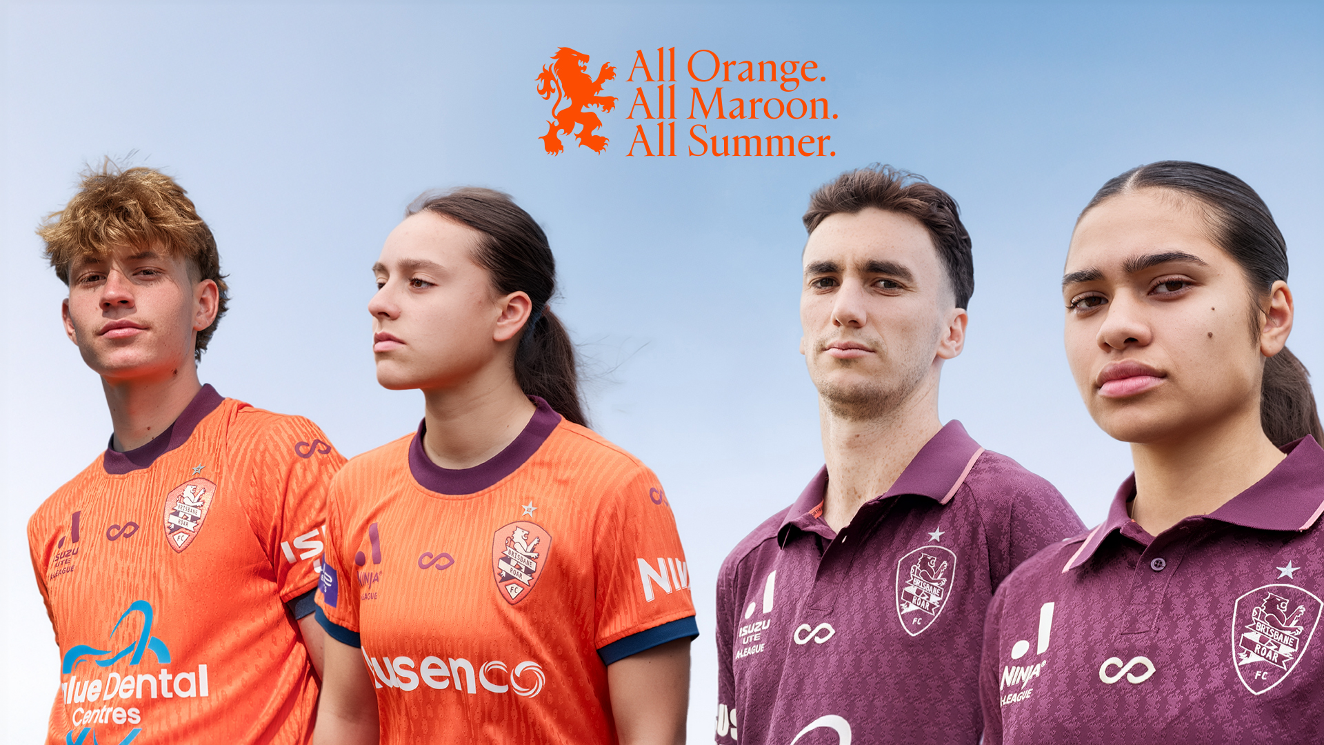
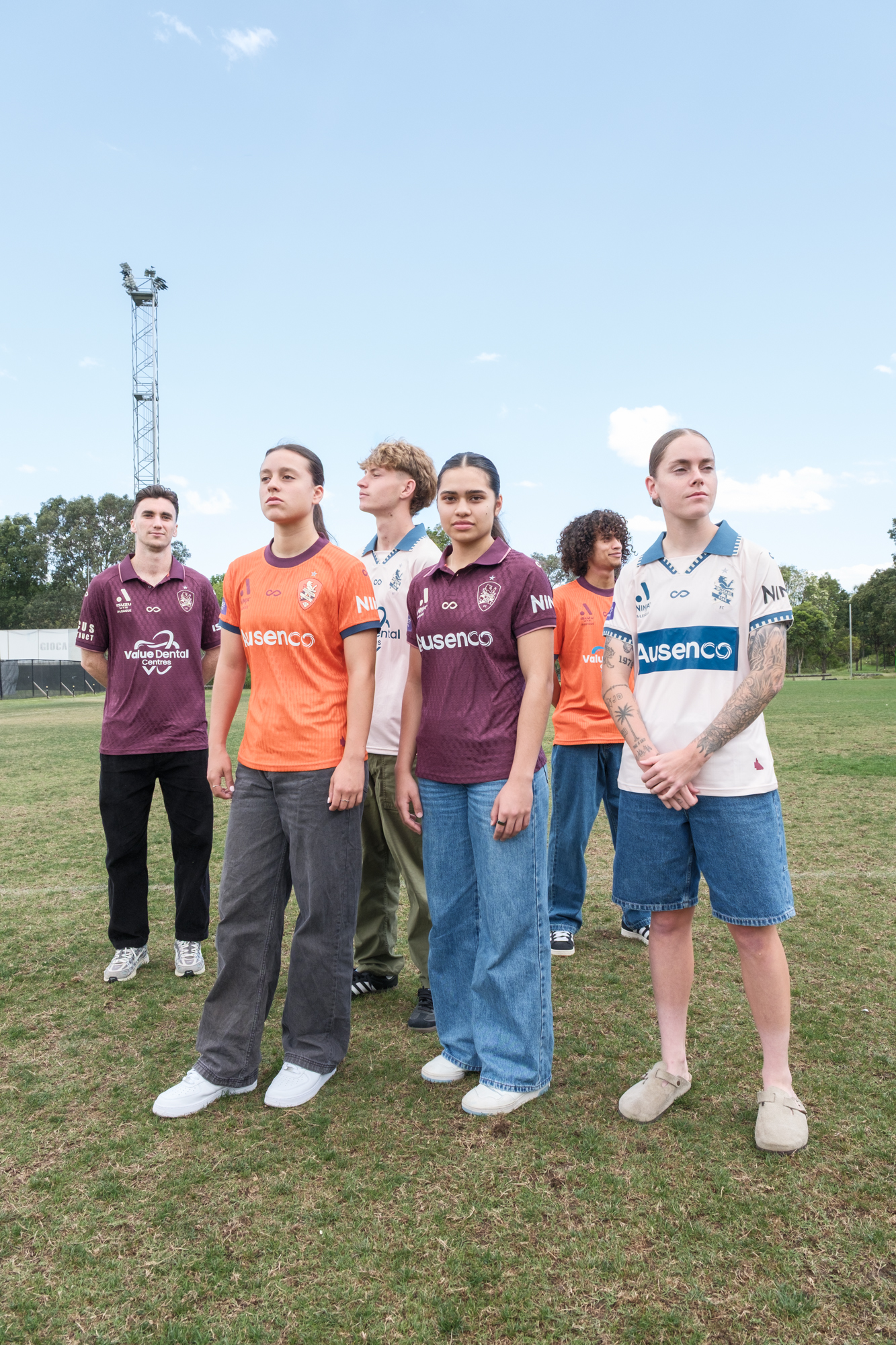
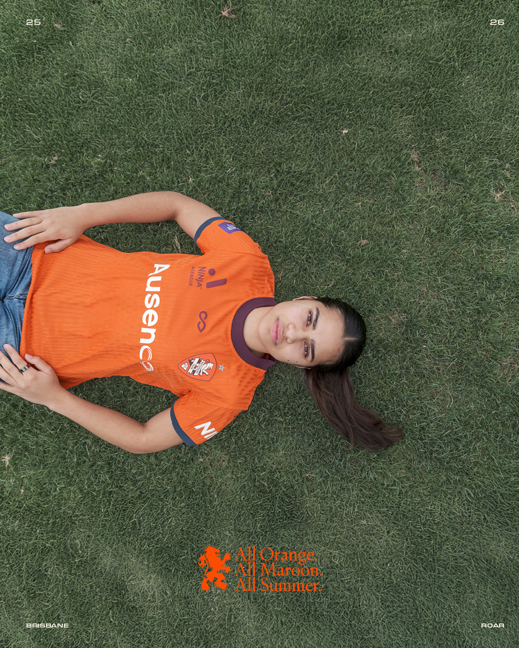
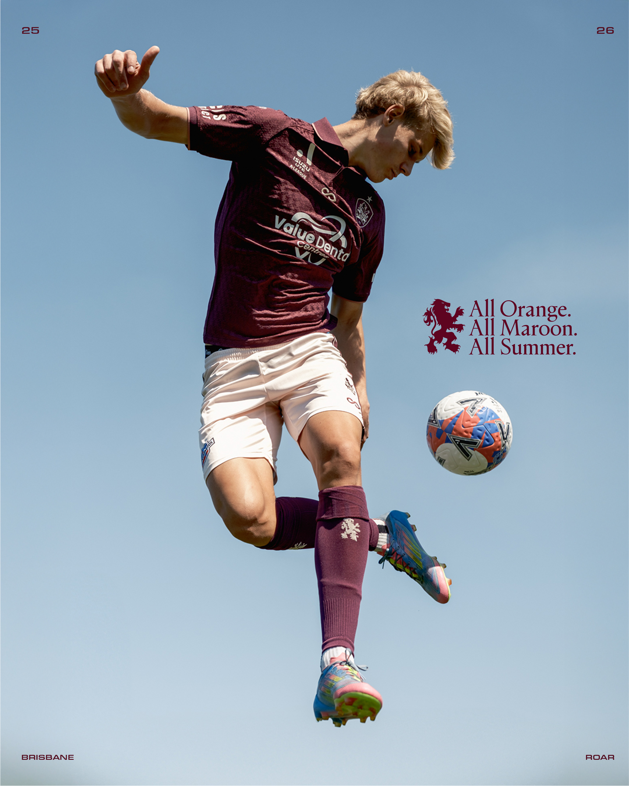
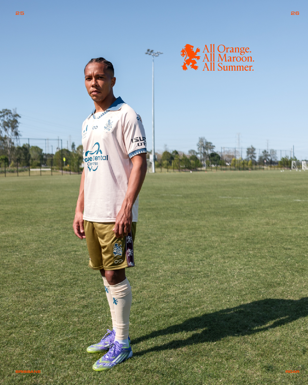
Who is art directing these shoots? FMDBrisbane Roar Kit 25/26
ZZZZZZZZZZMaybe Mono can tell you about South Melbournes club world cup kit, now that was a walking advertising board.
May we see a reappearance of this classic in the championship, when you play Olympic at Kogarah?
View attachment 3540
Hurt your feelings again ?ZZZZZZZZZZ
Not in the least..... you ARE getting a little repetitive in your old age though bloke....Hurt your feelings again ?
I have never before posted that ghastly shirt, with the boke inducing " Oceania club of the century " stitching before.Not in the least..... you ARE getting a little repetitive in your old age though bloke....
")
what gave it away, the wrinkles in the South shirt hanging in your closet? Iron that thing before posting next time please.I have never before posted that ghastly shirt, with the boke inducing " Oceania club of the century " stitching before.
As for the being repetitive, you don't do irony much, do you?
As an ousider I prefer your gold kits and quite like this coming seasons ones... But I have to say, this is the sexiest goddamn kit Newcastle has EVER worn... nothing comes remotely closeOK guys, here's the good the bad and the ugly that the Jets faithful have had to put up with over the years.
The narrative is biased towards gold, and some blatant lies thrown in but this is the mob that used Facebook to chose our colours
https://newcastlejetsfc.com.au/news/the-evolution-of-newcastle-jets-kits/
")

That was the one I disliked the most MSC, funny about tastes. That one was a nod to Newcastle Council which was a nod to the Newcastle Regiment back in the day. You an army guyAs an ousider I prefer your gold kits and quite like this coming seasons ones... But I have to say, this is the sexiest goddamn kit Newcastle has EVER worn... nothing comes remotely close
View attachment 3578
Hahaha all good mate, ones man's Ferrari is another's Ford. Not an army man, just something about a clean green kit with a crisp white line down the middle (with bonus of brown) just makes it pleasing to look atThat was the one I disliked the most MSC, funny about tastes. That one was a nod to Newcastle Council which was a nod to the Newcastle Regiment back in the day. You an army guy
- The 3 "circles" of the sponsor look revolved and balanced too... just always liked it .Nah. The original shiny gold Jets strip is the best.As an ousider I prefer your gold kits and quite like this coming seasons ones... But I have to say, this is the sexiest goddamn kit Newcastle has EVER worn... nothing comes remotely close
View attachment 3578

That’s extremely bland.Macarthur Away


