Welcome!
By registering with us, you'll be able to discuss, share and private message with other members of our community.
Sign Up Now!You are using an out of date browser. It may not display this or other websites correctly.
You should upgrade or use an alternative browser.
You should upgrade or use an alternative browser.
25/26 kit thread
- Thread starter AUFC_Fan
- Start date
Monoethnic Social Club
World-Class Star
- Joined
- Oct 17, 2024
- Replies
- 12,153
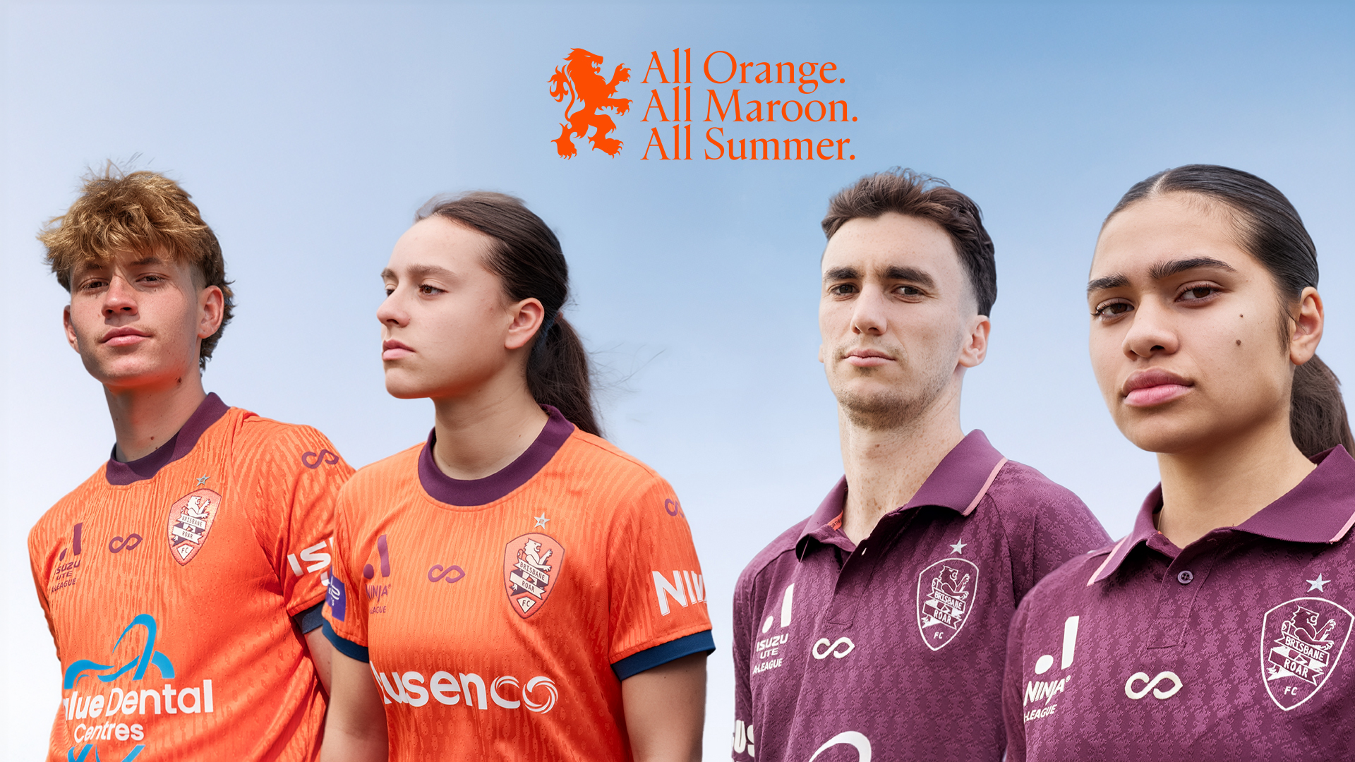
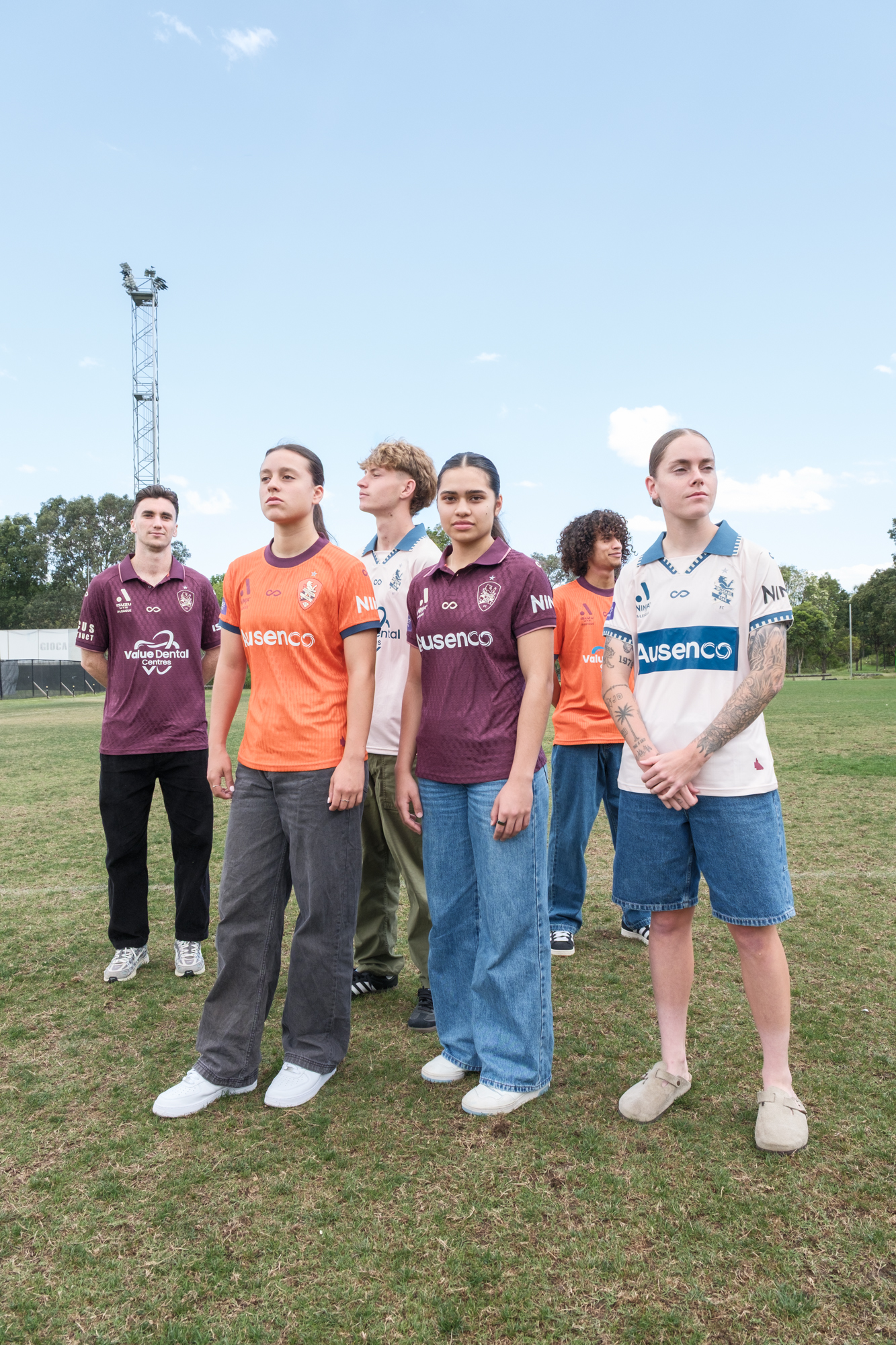
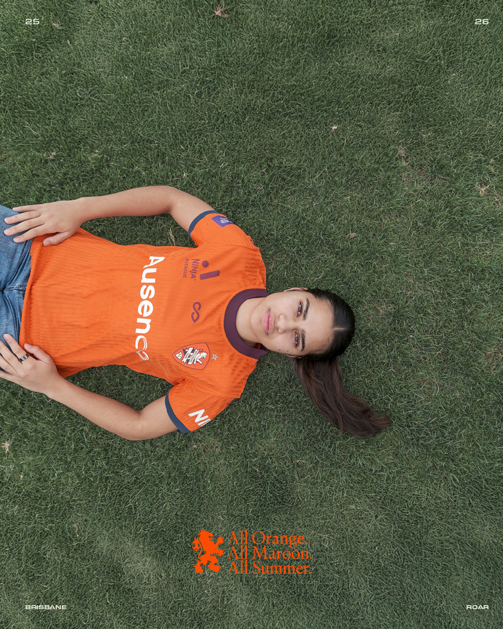
The third kit is magnificent... Looks like a 70s South Melbourne away kit... Im considering getting one... my first ALeague kit everBrisbane Roar Kit 25/26

someguyjc
Key Player
- Joined
- Oct 18, 2024
- Replies
- 811
It's an interesting kit, the collar and sleeve trim is meant to be a bit of a nod to the Brisbane flag.The third kit is magnificent... Looks like a 70s South Melbourne away kit... Im considering getting one... my first ALeague kit ever
Monoethnic Social Club
World-Class Star
- Joined
- Oct 17, 2024
- Replies
- 12,153
mmmmm those pretzels are making me thirstyIt's an interesting kit, the collar and sleeve trim is meant to be a bit of a nod to the Brisbane flag.


Guy Incognito
Benchwarmer
- Joined
- Aug 22, 2025
- Replies
- 117
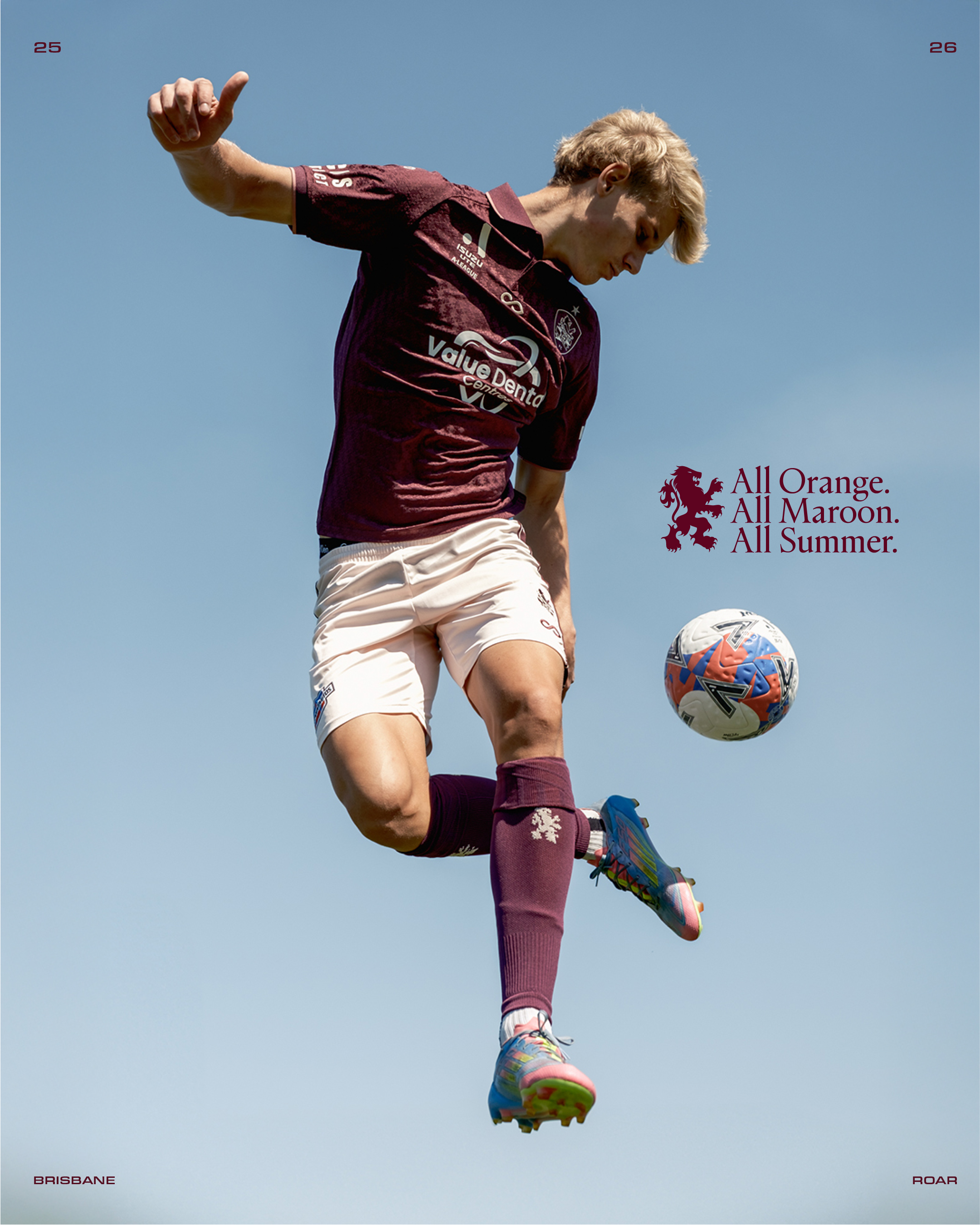
Might be a throwback to a certain grand final winning season…The home kit is an abominable colour combo. Orange and maroon is not a good look.
View attachment 3524

Keeper66
Fan Favourite
- Joined
- Oct 17, 2024
- Replies
- 1,285
I'm sure it is. Still a horrible combo though.
Keeper66
Fan Favourite
- Joined
- Oct 17, 2024
- Replies
- 1,285
Has there been any club that has gone anywhere near the number of shorts colour changes as Roar? Gone from blue (2 seasons) to maroon (4 seasons), to black (3 seasons), to orange (1 season), back to black (2 seasons), to white (1 season), back to black again (6 seasons), to blue again (1 season), and now back to maroon again?
FeedTheBrox
Impact Sub
- Joined
- Oct 18, 2024
- Replies
- 285
The home kit is an abominable colour combo. Orange and maroon is not a good look.
View attachment 3524
I agree, but its better than orange with blue shorts
Keeper66
Fan Favourite
- Joined
- Oct 17, 2024
- Replies
- 1,285
I don't mind the orange and blue combo (without maroon socks and trimI agree, but its better than orange with blue shorts
 ). Orange and blue has long been the colours of the original club Roar evolved from (Hollandia-Inala, Brisbane Lions, Queensland Lions, now Lions FC), from the original Dutch influence.
Roar92_
Reserve Player
- Joined
- Feb 12, 2025
- Replies
- 81
Absolutely love the away kit, so simple and clean and the fabric detail is lovely. Will be buying.
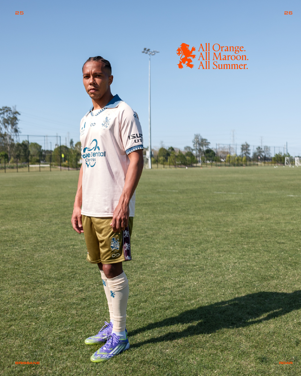
Not a fan of the green shorts on the third. Should’ve been the blue or the lighter colour from the shirt. On that, I think the lighter colour on the third shirt might be a really pale pink? Hard to tell but it looks like it. Guess we will have to wait for opportunity to purchase to confirm.
Not a fan of the green shorts on the third. Should’ve been the blue or the lighter colour from the shirt. On that, I think the lighter colour on the third shirt might be a really pale pink? Hard to tell but it looks like it. Guess we will have to wait for opportunity to purchase to confirm.
superpolska
Impact Sub
- Joined
- Feb 23, 2025
- Replies
- 253
this is the most they have embraced it in the 11 years now since the takeover?City slowly eroding any links to the old Melbourne Heart.
Keeper66
Fan Favourite
- Joined
- Oct 17, 2024
- Replies
- 1,285
Are those shorts green? I thought they were a shade of gold.Absolutely love the away kit, so simple and clean and the fabric detail is lovely. Will be buying.
Not a fan of the green shorts on the third. Should’ve been the blue or the lighter colour from the shirt. On that, I think the lighter colour on the third shirt might be a really pale pink? Hard to tell but it looks like it. Guess we will have to wait for opportunity to purchase to confirm.
Sutherlandbear
Club Veteran
- Joined
- Oct 17, 2024
- Replies
- 2,927
Definitely not Green FFS.Are those shorts green? I thought they were a shade of gold.

- Joined
- Nov 9, 2024
- Replies
- 879
Not sure whether I like the away or the third kit better. Either way, the womens version is much better than the mens. The sponsor fits perfectly on the kit on the womens.
Don't understand why they can't incorporate sponsors properly on Australian kits.
Don't understand why they can't incorporate sponsors properly on Australian kits.
- Joined
- Oct 17, 2024
- Replies
- 11,410
Do you mean the bigger logo on the men's taking up more shirt space? It's passed the aesthetic phase in that it's not just a flat different colour sticker box at least.Not sure whether I like the away or the third kit better. Either way, the womens version is much better than the mens. The sponsor fits perfectly on the kit on the womens.
Don't understand why they can't incorporate sponsors properly on Australian kits.
In turn, the women's white kit has done as such perfectly.
- Joined
- Nov 9, 2024
- Replies
- 879
bigger logo, poor colour choices, aesthetically doesn't fit in.Do you mean the bigger logo on the men's taking up more shirt space? It's passed the aesthetic phase in that it's not just a flat different colour sticker box at least.
In turn, the women's white kit has done as such perfectly.
- Joined
- Oct 17, 2024
- Replies
- 11,410
Less is definitely more with sponsors and in wonder what type of consultation does if the sponsor needs to say they're satisfied with the size and appearance of their company.bigger logo, poor colour choices, aesthetically doesn't fit in.
At least we're not like Austria clubs which are a walking advertisement.