Welcome!
By registering with us, you'll be able to discuss, share and private message with other members of our community.
Sign Up Now!You are using an out of date browser. It may not display this or other websites correctly.
You should upgrade or use an alternative browser.
You should upgrade or use an alternative browser.
Football Kits
- Thread starter NicCarBel
- Start date




Punchanello
Rotation Player
- Joined
- Jun 23, 2026
- Replies
- 320
What do we think about this? At first I thought it was cool, then it was giving me 1990's Parma vibes. Now it's giving me a headache

Punchanello
Rotation Player
- Joined
- Jun 23, 2026
- Replies
- 320
Also, River Plate released their 125th anniversary kit and played in it at the weekend. Sucked in because they had a 0-1 loss but the kit is very slick


NicCarBel
Club Legend
- Joined
- Oct 17, 2024
- Replies
- 4,272

- Thread Author
- #204
Surprised they didn't just go with this year's Leeds lookWhat do we think about this? At first I thought it was cool, then it was giving me 1990's Parma vibes. Now it's giving me a headache
View attachment 8528


- Joined
- Oct 17, 2024
- Replies
- 14,263
NOT a River fan in any way but that IS very nice.Also, River Plate released their 125th anniversary kit and played in it at the weekend. Sucked in because they had a 0-1 loss but the kit is very slick
View attachment 8529
Punchanello
Rotation Player
- Joined
- Jun 23, 2026
- Replies
- 320
I'd wear it to a party with sexshy ladies who don't know anyone who knows I am Boca.NOT a River fan in any way but that IS very nice.
NicCarBel
Club Legend
- Joined
- Oct 17, 2024
- Replies
- 4,272
- Thread Author
- #208
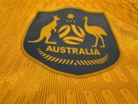
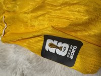
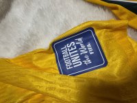
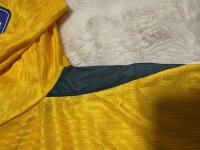
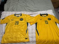
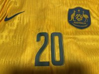
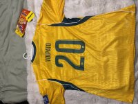
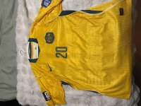
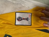
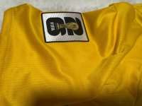
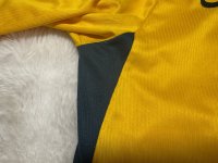
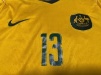
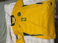
Thanks for reminder!Still waiting for those Aus kit pics @Nic
The golden yellow comes off a bit too bright in the photos - but the colour of it in person is spot on to me - just the green slightly off still
Attachments
-
 IMG_6477.jpeg1.1 MB · Views: 1
 -
 IMG_6478.jpeg1.4 MB · Views: 1
 -
 IMG_6479.jpeg1.3 MB · Views: 1
 -
 IMG_6480.jpeg1.5 MB · Views: 2
 -
 IMG_6482.jpeg1,003.9 KB · Views: 0
 -
 IMG_6476.jpeg1.5 MB · Views: 0
 -
 IMG_6483.jpeg1.3 MB · Views: 2
 -
 IMG_6475.jpeg1.1 MB · Views: 2
 -
 IMG_6474.jpeg1.5 MB · Views: 1
 -
 IMG_6473.jpeg1.4 MB · Views: 0
 -
 IMG_6472.jpeg1.5 MB · Views: 0
 -
 IMG_6471.jpeg1.4 MB · Views: 0
 -
 IMG_6470.jpeg887.7 KB · Views: 0
- Joined
- Oct 17, 2024
- Replies
- 14,263
hahaha I get the Wizz Fizz but JB HIFI? what am I missing with that one?Thanks for reminder!
The golden yellow comes off a bit too bright in the photos - but the colour of it in person is spot on to me - just the green slightly off still

- Joined
- Nov 9, 2024
- Replies
- 1,122
Can everyone just go back to doing kits like thisAlso, River Plate released their 125th anniversary kit and played in it at the weekend. Sucked in because they had a 0-1 loss but the kit is very slick
View attachment 8529

- Joined
- Dec 4, 2024
- Replies
- 10,111
Singapore have since changed kit manufacturers to Adidas from Nike, with the new kits making their debut during their last ASEAN Championship group stage match against Indonesia on August 7th.

melbcityguy
Club Legend
- Joined
- Oct 20, 2024
- Replies
- 4,987

2026/27 Home & Away Shirts Back in Stock
Whitby Town is delighted to announce that our popular home and away shirts are now fully back in stock across all sizes.
 www.whitbytownfc.com
Whitby town dracula themed away kit

- Joined
- Oct 17, 2024
- Replies
- 14,263
Why is the little Egyptian king branded a papara in Turkey? 
Thats so disrespectful.

Thats so disrespectful.